April 25, 2023
Elizabeth Cash
User ExperienceDigital MarketingWeb Design
How To Use CTA Buttons To Increase Website Conversions
As individuals, we’re often told we only have one chance to make a good first impression, so it’s best to be clear, informative and true to oneself. This wisdom also applies to your brand’s first impression when visitors interact on your website for the first time. The content on your website should be easy to understand, beneficial, on par with your brand personality and ultimately compelling to the reader. In today’s digital-savvy society, website visitors care about the experience they have on your website, and a call-to-action button strategy is one surefire way to not only improve the user experience, but also increase your website conversions.
Call-to-action (CTA) buttons are one of the best (and easiest) ways to clearly communicate with a website visitor. CTA buttons visually attract the eye, making them easy to spot on the page. In addition, marketers can customize the button text to encourage the exact conversion they’d like visitors to take.
At Blue Compass, our digital experts often look for opportunities to optimize on-page CTA button usage, so follow along as we share our CTA button best practices and insights for CTA button designs that will help increase your website conversions.
What Is A Call-To-Action On A Website?
A call-to-action on a website encourages a visitor to take action by clicking hyper-linked text or a button that leads to a service page, contact page or a phone number. Effective CTAs can be as simple as “Find Out More,” “Subscribe To Our Email List” or “Call Now.” General call-to-action best practices include:
- Easy-to-read text
- One to two CTAs per page
- Compelling copy
How CTA Buttons Can Help Increase Website Conversions
Call-to-action buttons increase website conversions by steering visitors toward the most appropriate web pages that support your sales funnel. By intuitively connecting visitors to the next logical place they need to be to take action, companies can enhance their website’s user experience (UX) and establish trust with website visitors.
Before writing CTA button text, you must decide which conversion you want your target audience to take. We recommend keeping in mind what content lives on the page and leaning into insights and data from how visitors are navigating through the website before making a conversion. Examples of simple call-to-actions that correlate with the respective desired conversion include:
- Sign Up - Invite web visitors to sign up for a free trial, a future event or even to be included on your email list.
- Subscribe - Use this CTA for your company blog or newsletter. Visitors are attracted to a CTA button like this because it isn’t asking for commitment but rather entices users who already enjoy what you do to stay connected.
- Get Started - This sentiment can drive a variety of actions you want your visitors to take, such as filling out a form to receive more information about a product or service.
- Add To Cart - This CTA is used by e-commerce businesses to encourage users to buy the products or services they’re currently looking at.
- Call Now - Clearly invite web visitors to call your business in order to learn more information. The best part? This type of call-to-action button can use HTML code to allow users to actually place the call when they click the link on a mobile phone.
Now that we’ve established why including CTA buttons can help increase website conversions, let’s dive into how they can boost your tracking capabilities in Google Analytics 4.
Yes, Google Analytics 4 Cares About Your CTA Buttons - And Here’s Why
At the end of June, Blue Compass—along with the rest of the world—will officially say goodbye to Universal Analytics and hello to Google Analytics 4 (GA4). Blue Compass has extensively researched GA4’s new approach to how user interactions on a website are tracked and interpreted. Historically, bounce rate has been used by digital marketers to determine if users are engaging with the content on their website. However, with Google Analytics 4’s new engagement report, marketers can now measure their engagement through a variety of triggered interactions. Because Google Analytics 4 cares about every action a user takes on your website, CTA buttons that visitors click on will now be compiled in the GA4 engagement report. Any data that shows what a user is clicking on throughout your website is a great insight to see what drives conversions.
CTA Button Best Practices
A CTA button may be a small element on your website, but it can help increase website conversions, encourage lead generation and build trust with your target audience. Below are a few call-to-action best practices to ensure your CTA button strategy is effective by considering size, placement and more.
Ideal Size For CTA Buttons
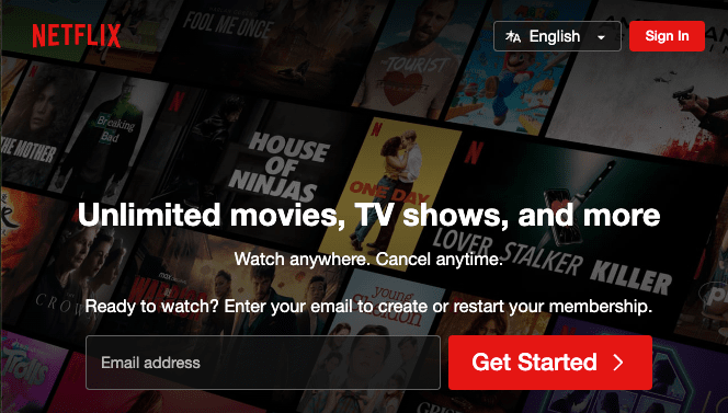
Your button should be big enough to draw the visitors’ eyes to it but not be obnoxiously large in size. With that said, it’s important to consider the natural hierarchy of size when designing CTA buttons. Primary CTAs should be closer in size to your H1 and H2 than to the body of your copy. CTA buttons that aren’t as important should be in an H3 or H4 size.

In the example above, Netflix uses a variety of CTA buttons in various sizes. The most important goal for Netflix is to increase subscribers, so their largest CTA button is “Get Started.” For a seamless user experience, the subscription service also provides a smaller CTA button located in the top right corner for current users to log in.
Although button size is important, call-to-action button placement is just as critical when it comes to following call-to-action best practices.
CTA Button Placement
CTA button placement is an important aspect to strategize when optimizing or building a website. Western culture reads top to bottom and left to right, so when thinking about the user experience on your site, keep the natural flow of eyes on-screen in mind when placing your CTA buttons.
Studies have shown that CTA buttons placed toward the bottom or to the right of the page content outperform alternative placements. For example, if you wanted to put a "Sign Up" button on your website, it's best practice to place the button after the visitor reads the content because it may be confusing to sign up for an offer they don't know anything about yet. Be sure to keep in mind how CTA button placement will appear on both the desktop and mobile versions of your content.
White Space Usage On Desktop vs. Mobile
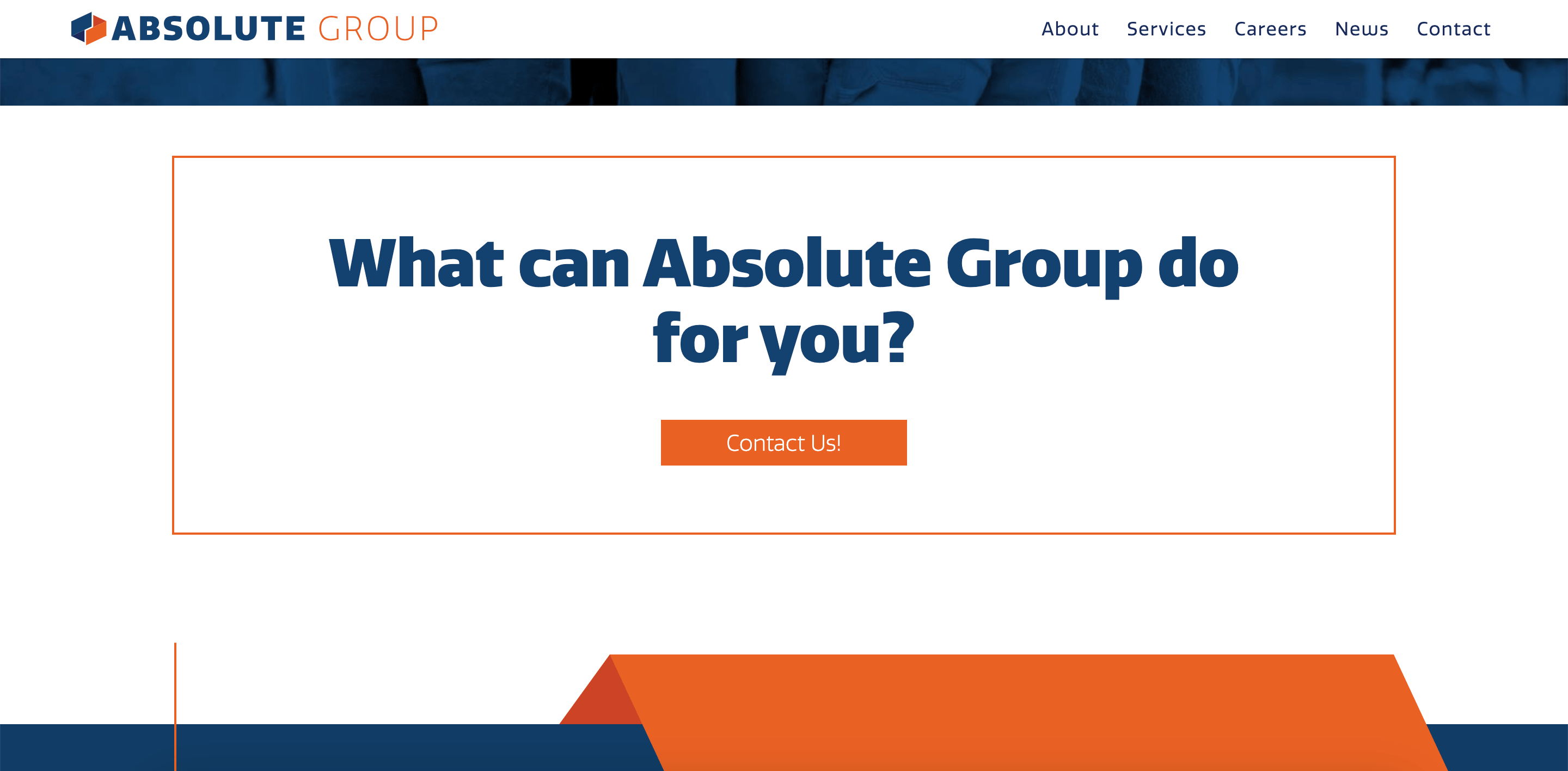
Optimizing CTA buttons for both the desktop and mobile versions of your website ensures CTA button best practices are in place for maximum impact on all users of your site. The screen on a mobile phone is much smaller than that of a desktop, so it's crucial to ensure the button stands out and has plenty of white space around it. Providing a healthy amount of white space around the call-to-action button on both desktop and mobile provides an easy user experience and helps to increase website conversions by grabbing users' attention and giving them direction on what action they can take next.


Blue Compass’ client, Absolute Group, is a great example of how we allow white space on both desktop and mobile versions of their website.
There Is Such A Thing As Too Many CTA Buttons
The saying “less is more” applies to many circumstances, and CTA buttons are no different. Because users can get overwhelmed when there are too many actions available for them to take, you’ll want to discuss with your team which call-to-action is most important on each page of your website. At Blue Compass, we recommend focusing on one or two obvious call-to-action buttons and leading people to take those desired next steps. If you want to include multiple button choices, we suggest you use the hierarchy strategy we discussed above and choose one action to take precedence over the others. If you already have a preferred conversion path, follow this when creating your CTA button hierarchy.

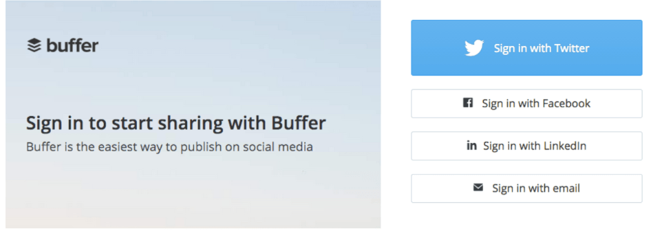
For example, Buffer provides a variety of sign in options for its users. However, based on the color, size and placement of each button, it’s implied that Buffer prefers users to sign in with a Twitter account. Use this call-to-action best practice when you want to give your website visitors options without creating decision fatigue.
CTA Button Text
There's no secret formula for writing the perfect CTA button, but our digital marketing experts recommend keeping the text on the shorter side. Try to keep CTA button text no longer than four words and incorporate strong verbs that can help you make the most of the limited word count. Communicating what you want your user to do in a concise manner will help them take the desired action fast and without much second-guessing.
Carefully Optimize Your CTA Button Design
We chatted with our Art Director, Jason Handy, to uncover the features he considers when it comes to CTA button design. His biggest piece of advice was to take advantage of the fold (the part of the page that is visible without scrolling). Since the top of the homepage is the first place users look when they visit a website, this holds the most value in terms of CTA button placement. Below the fold, he recommends CTA buttons focus on brand-building and link to informational areas to help users learn more about your business. As users continue to stay engaged on your website, building their knowledge of what products and services you offer, Jason suggests providing CTA buttons near the mid to bottom of the page that offer multiple conversion points.
Without hesitation, Jason emphasized that the most important part of the button is the actual call-to-action language. He stays away from basic phrases like “Learn More” or “Contact Us” and opts for more descriptive verbiage like “Get a Quote” or “Talk With Our Team” because phrases like these better tell visitors what they can expect to do when they click on the button. Understanding the customer journey and using CTA button language to lead visitors through your sales funnel will increase website conversions.
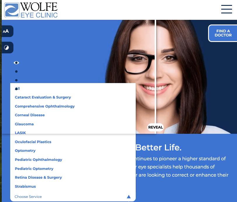
One of his favorite examples of flexible and unique CTA button design is from a Blue Compass Client–Wolfe Eye Clinic. Because Wolfe Eye Clinic offers multiple services, Jason wanted to create a call-to-action button that allowed the user to easily select the service they were looking for. Offering multiple CTA buttons that keep the user experience top of mind saves the visitor time searching and ensures an appointment is booked with ease.

When it comes to color, Jason ensures his buttons are ADA-compliant and made up of low-contrast colors so the CTA is clearly legible on any device. He recommends CTA buttons have a unique identifiable color that stands out from the rest of the website to help visitors understand that they’re clickable.
Your CTA buttons can look the part, but they will not increase your web conversions if they’re not working properly!
Test Your CTA Buttons
Just like testing ingredients to perfect your secret sauce, it’s good practice to test your CTA buttons every once in a while. Because your CTA buttons lead visitors to another page on your site, it’s recommended to test the buttons (and links) often to ensure nothing has broken on your webpage. There’s nothing worse than putting in the work to create clear CTAs only to miss out on conversions due to a broken link!
Ready To Increase Website Conversions? Talk With Our Web Design Experts!
At Blue Compass, we don’t believe in a one-size-fits-all digital marketing strategy for our clients. We provide a customized approach to every client we serve to ensure we help them succeed in their business goals. Our digital experts continue to stay up-to-date on digital marketing and web design best practices to ensure we’re always providing clients with the best of the best. Our preferred content management system gives us the ability to customize the design and placement of CTA buttons that meet call-to-action best practices so you can increase website conversions. Contact us today to learn how we can help set your website up for success!