July 22, 2024
Kelsey Way
User ExperienceWeb DesignWeb Development
How To Master Good Website Navigation For A Great User Experience
In today's fast-paced digital world, where user attention is a precious commodity and online competition is intense, our Blue Compass experts cannot stress the importance of effective website navigation enough. Good website navigation is the backbone of a seamless user experience, guiding visitors throughout your content and helping them effortlessly find what they need without frustration. While a visually appealing web design with cutting-edge features can impress visitors, intuitive navigation ensures they can easily access information about your services, contact your team or buy your product.
This blog identifies website navigation best practices and websites with good navigation so you know exactly what you need to do to take your navigation from good to great!
What Is Good Navigation On A Website?
Good website navigation seamlessly connects users to the information they're searching for by logically organizing navigation links in a structured manner with clear and descriptive labels. This helps users feel comfortable and familiar as they explore the site. Overall, because your website is your most important marketing tool, prioritizing effective navigation enables visitors to effortlessly browse and interact with content, inherently enhancing their experience and engagement.
Understanding and applying good navigation best practices will empower you to design a website that stands out. Let's delve into key principles that will help you enhance your website's navigation and ensure it serves as a powerful tool for your business.
Essential Website Navigation Best Practices
Navigating a website should feel natural and straightforward, much like finding your way through a well-organized store. When users visit a site, they should be able to locate the information they need quickly and without confusion. Follow these key website navigation best practices to achieve effective website navigation:
Ensure Navigation Across Desktop & Mobile Is Seamless
It's not just about convenience anymore; it's about meeting the evolving expectations of consumers who demand fluidity in their digital interactions. People switch between devices, from their phones to computers and back, without even thinking about it. Brands that offer a seamless navigation experience on desktop and mobile thrive in today’s competitive landscape. Think about it: whether someone's browsing on their laptop or their phone, they should be able to find what they're looking for without any hassle. For example, imagine you're checking out a clothing store's website. You want to quickly find the "New Arrivals" section to see the latest trends. On your desktop, it's right there in the top menu bar, easy to spot. And when you're on your phone, it's just as accessible, neatly tucked into a drop-down menu for effortless browsing. That's the kind of experience your website should offer—smooth and intuitive, no matter the device.
Additionally, it's crucial to prioritize accessibility on both desktop and mobile to ensure your website caters to everyone, regardless of their abilities. Implementing features like alternative text for images aids users who depend on screen readers to browse your website content. Blue Compass maintains a stringent stance on ADA Compliance for websites, which involves processes like comprehensive color contrast testing to ensure inclusivity and usability for all visitors. By focusing on ADA compliance, you not only enhance user experience but also meet legal standards and broaden your audience reach.
Optimize Navigation Labels With Keywords
When you incorporate relevant keywords into your navigation, you're essentially speaking the same language as your visitors. Imagine you have a bakery website, and instead of simply labeling your navigation tabs "Menu" or "Products," you use keywords like "Cupcakes," "Breads" or "Pastries." These are terms potential customers are likely to search for when browsing for baked goods online. By aligning your navigation labels with the language your users are familiar with, you're making it easier for them to find what they’re looking for.
Moreover, integrating keywords into your navigation enhances your site's SEO efforts. Search engines pay close attention to the text used in navigation menus, so by including relevant keywords you're signaling to search engines what your site is about and what topics it covers. This increases the likelihood of your site ranking higher in search results when users search for those keywords.
Craft A Clear & Intuitive Navigation Layout
Ensuring your navigation is well-organized with a logical hierarchy can make a significant difference in user experience. For example, grouping related items under broad categories, such as "Products," "Services," and "Contact Us," can streamline the process for users to locate specific information. Keep in mind not to over-stuff your navigation menu with too many links, as it can overwhelm users and make it more difficult to find what they need. Instead, use dropdown menus or subpages to keep things simple. Additionally, consider using visual indicators like icons or color codes to help users quickly identify different sections.
Guide Users To Important Content
Convince visitors to take action on your site by strategically guiding them to key content. (Pro tip: before deciding on a navigation design, lay out your content in an organized chart to decide how you want to group it.) By prioritizing navigation links based on content valuable to users and aligned with your product or service, visitors will easily find what they’re looking for. To enhance this even further, incorporate clear and intuitive call-to-action (CTA) buttons. These buttons not only tell your users what to do next but also help them take the actions you want them to take!
Think of website navigation as the friendly host of a party. Just as a good host anticipates guests' needs, your navigation should intuitively lead users to where they want to go.
Get Inspired By Websites With Good Navigation
Imagine landing on a website and immediately knowing where to go to find what you need. That's the power of websites with good navigation. It turns your browsing experience into a smooth ride, effortlessly guiding you to the right information. By checking out websites with great navigation, you can get ideas and tips to improve your own design. Let's take a look at some awesome examples that nail the art of good website navigation.
OvaEasy Makes Shopping Easy

OvaEasy’s website navigation is effective due to its clear and organized structure. Key categories like "Shop," "Recipes" and "Our Story" are prominently displayed in the top menu, making it easy for users to find products and information. Each main category has well-defined subcategories, ensuring users can quickly locate specific items or details. The homepage also features prominent call-to-action buttons and sections highlighting popular products and recipes, enhancing the overall user experience by carrying key components of the navigation throughout the site.
Lozier Heating & Cooling Puts Their Audience First

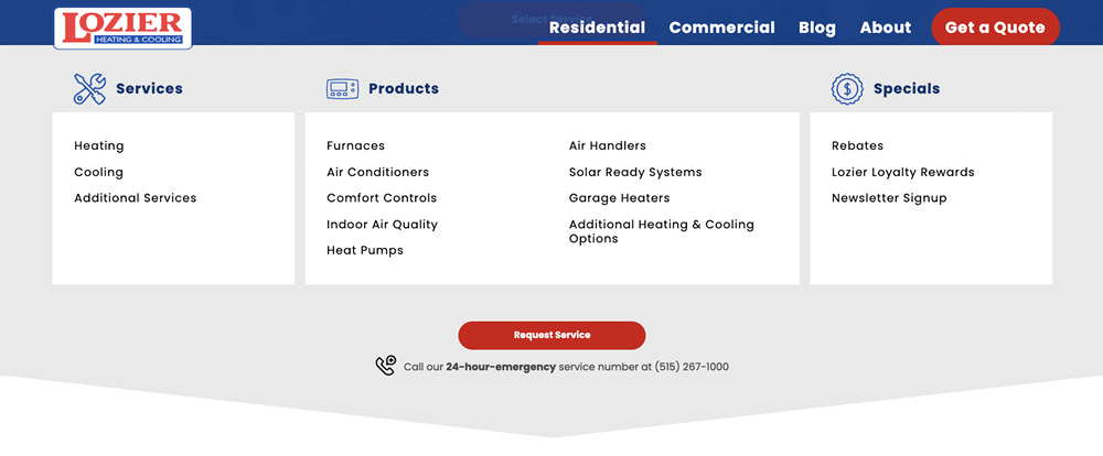
The Lozier Heating and Cooling website offers a user-friendly navigation experience tailored to its audience. The clear division of services into Residential and Commercial categories allows visitors to easily find relevant information. Prominent buttons for requesting service and getting quotes cater to customer needs by providing quick access to essential actions. Additionally, detailed sections for Heating, Cooling and other services ensure that users can efficiently locate and understand the offerings, making their online experience seamless and informative.
ViClarity Thrives On Desktop & Mobile

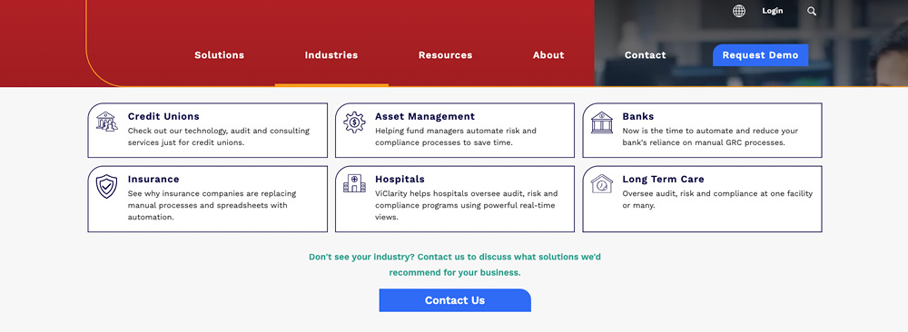
ViClarity’s website excels in responsive design, providing a consistent user experience across both mobile and desktop platforms. The layout adapts beautifully to different screen sizes, ensuring that the navigation remains intuitive and accessible. Menus, buttons and links are optimized for touch interaction on mobile devices while remaining organized on desktop screens. This responsiveness guarantees easy access to information and services on smartphones, tablets or computers.
Take Your Good Website Navigation To Great By Talking With Our Experts
At Blue Compass, we're dedicated to making online experiences effortless, and we understand that the heart of any great website is a navigation that puts users first. That's why we specialize in crafting seamless, intuitive web designs that not only enhance user experience but also drive conversions. Reach out to schedule a 30 minute consultation to talk about your web design.