Flat Design Goes 3D: Isometric Flat Design
Following web design trends can feel a bit like watching Groundhog Day. In the movie, Bill Murray’s character relives the same day over and over, always seeing the same things and experiencing the same events. Tracking digital trends can feel the same way — seeing the same designs over and over.
But Bill Murray eventually realizes how to make small changes in order to manipulate the day’s outcome, and web experts can do the same thing with popular trends. If a certain design style is causing user experience issues or is no longer capturing users’ attention, designers can put a twist on that style rather than changing it entirely.
Since its rise to popularity in 2012, the flat design trend has shifted and changed in order to provide a better user experience for viewers and website visitors. Read on to learn how this style has evolved and how designers can use it to create imaginative, attention-grabbing graphics.
From 3D To Flat And Back: The History Of Flat Design

Before Flat Design: Skeuomorphic Design
Before flat design rose in popularity, skeuomorphic design was king. Skeuomorphic illustrations, icons and logos feature shading, highlights, textures and more in order to make images and objects look like their real-world counterparts. For example, when the first iPhone came out in 2007, its apps and buttons were designed to look realistic in order to help users transition to the experience of using a touchscreen with no tactile buttons.
Flat Design 1.0: Simple And Streamlined
When the shift toward flat design began, users learned how to interact with touchscreen devices and they became familiar with common icons, shortcuts and device functions. Realistic designs were no longer needed to teach people how to use their devices, and in fact, complex, realistic designs started to feel cluttered within user interfaces.
In order to combat the clutter and improve the user experience, designers started creating minimalist, flat designs to replace skeuomorphic illustrations and icons. The new flat design UX was a welcome change for users because it made apps and devices more streamlined and simpler to use. By using flat imagery, designers can provide a clearer user pathway and emphasize important messaging.
Flat Design 2.0: Improved Flat Design UX
Overall, users benefitted from the shift from skeuomorphic design to flat design, but web designers and UX researchers discovered a few flat design UX issues. For example, some users may not click on a flat button if they don’t recognize it as a clickable element.
In order to provide a better user experience, flat design needed to evolve. Instead of creating completely flat icons, logos and illustrations, designers began to add small details like highlights, gradients and drop shadows. These elements add depth and direction to icons and images while maintaining a focus on minimalism and preventing the style from backsliding into skeuomorphism.
Flat Design 3.0: 3D Isometric Design
While flat design 2.0 evolved from the original iteration in order to address some flat design UX issues, we’re now starting to see a new trend emerge: isometric design, also known as flat 3D design.
Flat 3D design may seem like a stylistic paradox, but it’s actually a natural progression of the flat design trend. Throughout the history of flat design, designers have been striving to enhance the user experience. In order to be effective, flat designs should simplify user pathways and highlight important messaging, but in order to stand out on a page, designs need depth and dimension. While flat design 2.0 simply added depth to images, isometric design actually makes designs appear 3D.
Because it presents a three-dimensional view of an object, isometric flat design is a great option for a number of different types of projects. This flat 3D design style combines some elements of realism from skeuomorphism with the clean, modern approach of flat design.
Is Isometric Design 2D Or 3D?
We understand, “flat 3D design” sounds contradictory. In the words of author Rob Hooks, isometric design is “Kind of like flat design and 3D design having a baby.” Isometric flat designs are created in a 2D space, but they appear 3D due to the use of specific line angles. In order to create isometric designs, you don’t need fancy 3D design software, you just need some basic geometry knowledge.
The 120° Rule Of Isometric Design

The word isometric means “equal measure.” When it comes to graphic design, isometric style involves depicting a 3D object in a 2D plane. But unlike classic 3D illustration techniques that utilize true perspective, isometric design involves specific angles and parallel lines to achieve a 3D style that is both realistic and whimsical.
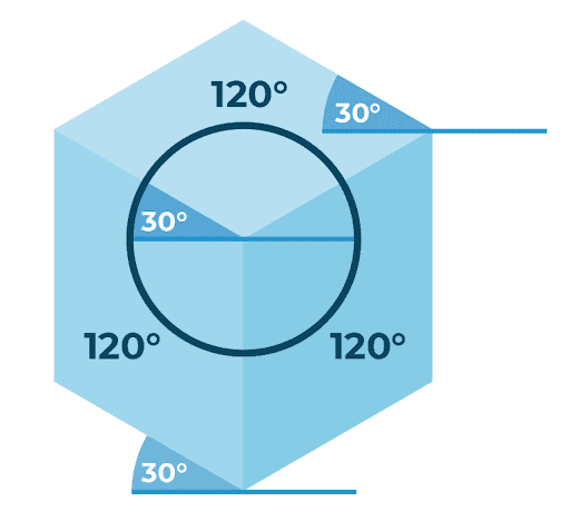
There are many ways to render a 3D object in a 2D plane, but not all 3D renderings are isometric. An image is only isometric if there’s a 120 degree angle between the x, y and z axis. These equal angles give the style its name — isometric, meaning “equal measure.”
The Parallel Rule Of Isometric Design

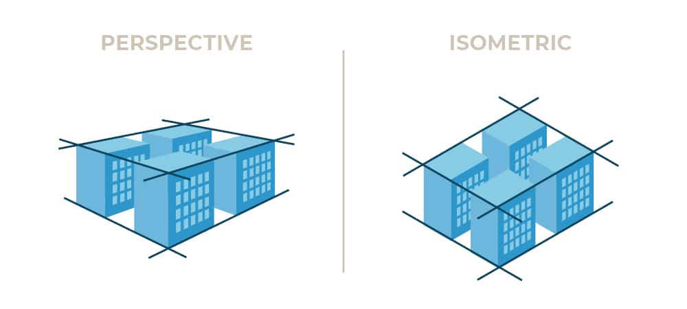
With some 3D drawings, designers consider how the human eye naturally perceives things, and objects are rendered using “true perspective.” In a true perspective design, parallel lines converge at a vanishing point. In an isometric design, parallel lines never converge.
Isometric Flat Design Best Practices
Although isometric design is trending, it’s not the best option for every design project. It’s also easy to misuse flat 3D design and unintentionally muddle your messaging. Follow these guidelines in order to use isometric design to effectively support your brand.
Choose Appropriate Applications
Don’t make the mistake of jumping on the isometric flat design bandwagon and using it for every single project. Here are some of our favorite ways to use isometric design to enhance flat design US:
1. Maps And Floor Plans

Instead of the typical top-down view of a map or floor plan, isometric designs allow you to display a unique perspective. When creating an isometric map, designers can create 3D elements that would otherwise be flattened on a traditional map.
2. DIY Instructions
Before isometric style became popular with graphic artists and web designers, engineers and technical illustrators were using isometric projections to show complex objects, machines and systems. This flat 3D design style remains one of the best ways to illustrate complicated objects and processes.
3. Layered Graphics

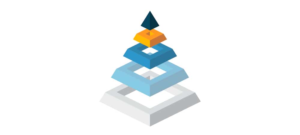
Just as with technical drawings and DIY diagrams, isometric style is perfect for displaying layered items. In a layered isometric graphic, viewers can perceive two full sides of an object instead of one flat surface. This allows an image to contain more detail while remaining simple and easy to understand.
4. Icons And Logos

As we mentioned earlier, web professionals encountered flat design UX issues when flat illustrations confused users because they blended in too much. Isometric icons grab users’ attention and help them know where to click.
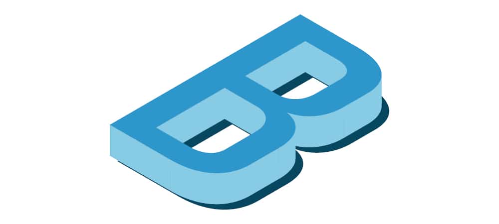
5. Creative Lettering And More

There are no hard-and-fast rules when it comes to 3D flat design, so experiment to see what isometric design applications work for your brand. This type of creative messaging can really catch users’ attention.
Maintain Minimalism
Isometric designs are inherently complex because they display multiple angles of an object or scene. Avoid clutter, and keep flat 3D designs as simple as possible. Users can easily become confused or overwhelmed if you try to do too much with a design.
Evolving Flat Design At Blue Compass
If you’re looking for help incorporating fun, attention-grabbing isometric designs on your blog posts and web pages, reach out to Blue Compass. Our UX experts and web designers conduct user experience research in order to create designs that guide users toward specific actions. We can’t wait to help you achieve your business goals with isometric flat designs!