February 22, 2019
User ExperienceWeb Design
5 Ways Web Animation Can Improve The User Experience
Designers are always trying to stay on top of the latest web design trends, and it’s no secret that right now animated and interactive sites are capturing the attention of web designers and visitors alike.
When creating web animations, designers and developers know this will be one of the focal elements of the web design, so they spend a lot of time creating storyboards and analyzing UX research to think through how the movement will guide the user to their next action and hopefully lead them to converting. Drawing your users’ attention to your most important information on your website helps with the user experience because they won’t have to guess where to look and where to go next; the movement will capture their attention and lead them to their next steps.
Our web designers and developers are loving the challenges and opportunities that animation design brings to the table, and our UX researchers enjoy how long it keeps people engaged on the page! There’s a variety of techniques that can be used to incorporate interactive content throughout a website, so we’re going to review a few of our favorite examples and the top reasons to invest the extra time into an animation website.
Why Is Web Animation An Important UX Design Trend?
People get excited about interactive web design because the human eye is attracted to motion. When we see movement involved in a design, we react to those visual cues and look forward to what’s going to happen next. In the same way that a video in more likely to grab your attention on a social media feed, interactive sites following web design trends are going to stand out and demand your attention.
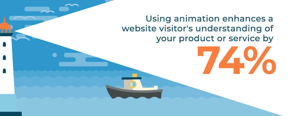
For businesses, the benefit of having an interactive site and using movement or video is that it delivers a lot of information in a small amount of time. This reduces the user’s cognitive load and gives them an interesting way to learn more about your business. According to Viget, web animation increases people’s understanding of your product or service by 74%, so take advantage of this UX design trend and follow landing page UX best practices to find the best way to incorporate movement on your landing page and create a successful animation website.
Animation design can be used to quickly engage a user and create excitement around the subject of the content. If you’re looking for a fun way to stand out from the crowd online, tell your brand’s story and try to incorporate web animation. UX storytelling can be used to encourage your visitors to keep scrolling and exploring your site.
Examples Of Interactive Sites And Apps

This animation website captivates their visitors using a central theme and animation designs to keep you interested in what’s coming next. Species in Pieces puts together the shapes of endangered animals to get people excited about an overlooked topic. Check out their interactive site to see all 30 animated species.

This brand welcomes their users with a web animation that’s a fun play-on-words with their name. Since this platform is a place where designers can share their creative work with each other, it makes sense that the dribble site utilizes animation and other UX design trends.
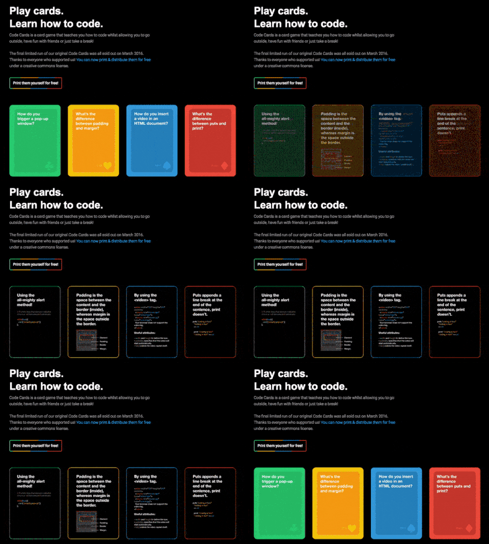
The interactive web design on Code Cards gives visitors a sneak peak of their products by flashing the answers to the coding questions. This is a much more exciting way to grab a users’ attention and lets developers know what they can expect when they purchase the card game, as compared to just displaying images of the cards.

This beautiful, intergalactic web design is appealing on its own, but it’s even more exciting for visitors since it’s an animation website. The suspense created in the beginning as you’re “flying through space” leaves users wanting to see where their journey leads. We also enjoy Bright Media’s use of many popular design trends, including gradients and diagonal website designs.
Interactive web designs can lead visitors to take action and guide them through complicated tasks. UX research indicates that movement and direction on interactive sites assists users to make decisions on what to do next and it can also be used to show progress, such as the steps of filling out a form.
Examples Of Actionable Animation Websites
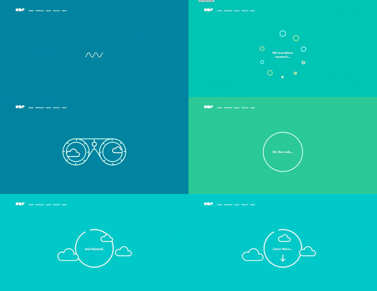
This example clearly gives website visitors direction by asking them to continue scrolling. One Design Company uses web animation to grab your attention from the start, then gives a brief overview of what they do to convince you to learn more about them by exploring their website.

We like the playful introduction this agency gives themselves when you enter their domain, and they show off their design and development skills with the different animation designs. This design is a bit more subtle at directing users, but the moving diagonal lines guide users to follow their non-traditional scroll to the right.
Psst - Studio Bjork is also featured in our black & white web design blog. Check it out!
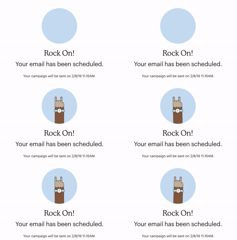
Web animation isn’t just for leading website visitors to complete a task; it can also be used to reward users for reaching their goal. MailChimp uses this fun and simple animation to congratulate people for scheduling an email campaign.
Whatever the message or primary conversation point you are trying to convey, subtle animation can draw attention to these areas on the page. We’ve gathered examples of messages that are typically ignored, but with animation designs, they become the interesting focus of the page.
Interactive Sites Using Animation Design To Make Dull Messages Exciting

Most websites have a pop-up message explaining they use cookies to gather data and give you a better experience, but most people immediately dismiss it. However, the cookies message on Jökulá is hard to ignore with the cute milk and cookies dancing around on your screen!
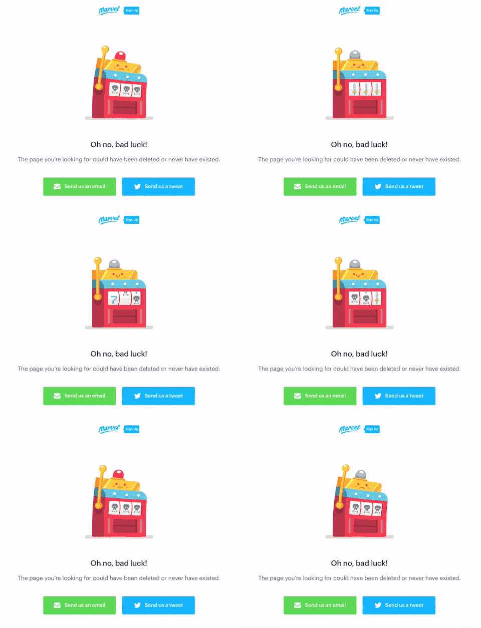
No one is excited to get a 404 page while browsing a website, but the Marvel app found a creative way to deliver the disappointing news with an entertaining web animation.

Consider adding an inventive animation design to your loading page to keep users interested while they wait. We love the way 7up kept theirs true to their brand with the caffeinated bubbles rising as the page loads.
The designer’s purpose behind an interactive web design is to make the users’ journey simple and engaging by giving them visual cues. One way to do this is by including hover animation. This is an obvious way to give visual feedback to users and gives them the satisfying feeling that they are interacting with real elements on the page.
Examples Of Hover Animation Websites
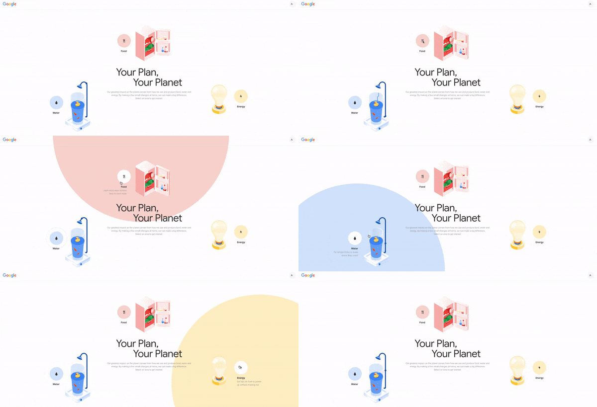
Google’s Your Plan, Your Planet landing page prompts users to learn more about the three most common ways to conserve energy with an interactive web design. Each element has small animation designs, then when you hover over each button, it grows into a larger circle to emphasize the theme you’re clicking on. This is a clever hover state that definitely captures your interest.
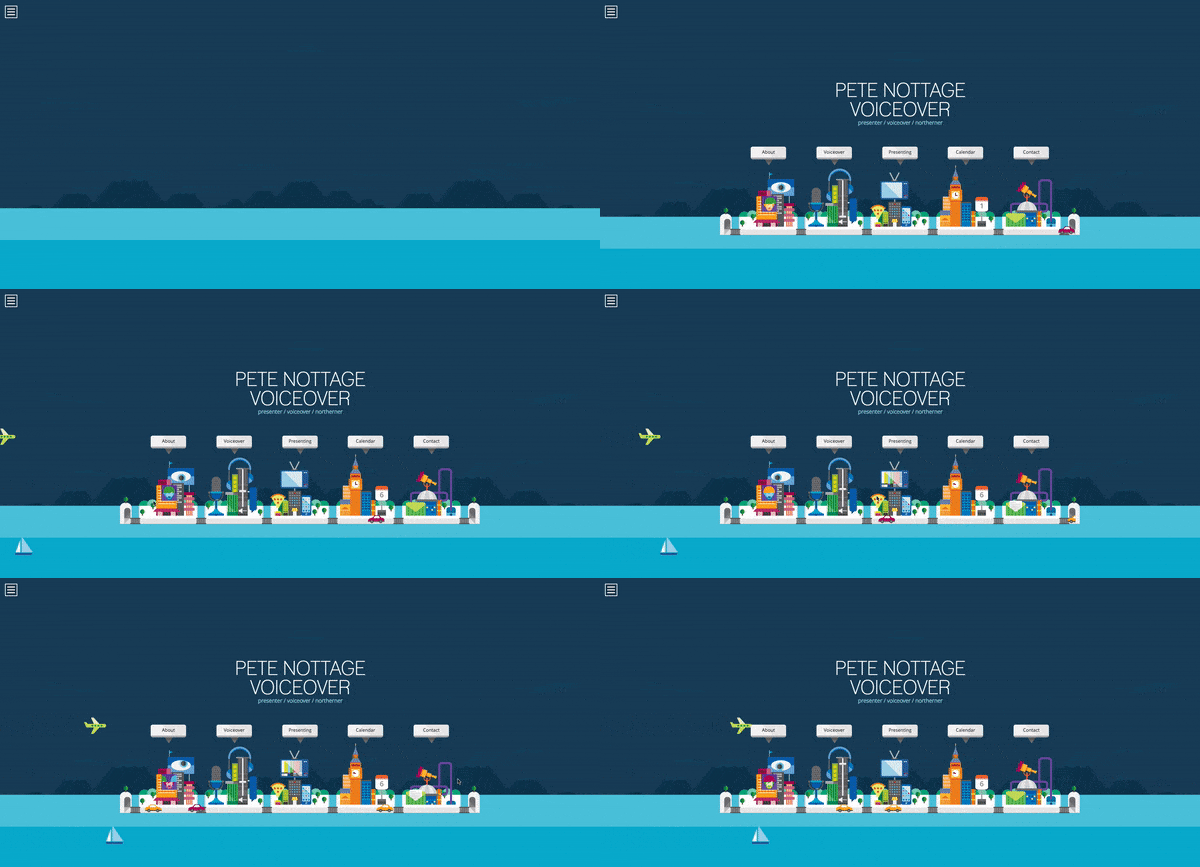
This incredible, tiny civilization on the Pete Nottage website has a lot of moving parts that could keep users scanning the page for extended periods of time. We really like how the different parts bounce to life when you hover over them. In this example the hover animation is subtle, so try to follow along with the mouse above.
The purpose of including UX design trends on your website is to persuade your visitors to scroll and discover more. This increases their likelihood of learning more about your brand and potentially converting. This is why website scroll animation is becoming a popular web design trend that captures users’ attention throughout their journey on the site. It’s also beneficial for reducing load time so people will not dart off right away since not all the elements on the page need to load right away.
Interactive Web Design & Scroll Animation Examples

Add excitement to every page of your site by adding web animation to the scroll! Our designers created the Igor site to look modern and innovative, just like their PoE products and services. The scroll helps differentiate and introduce each of their product lines.

The animation design on Discovery continually has new page elements popping up and keeping the user guessing. We really like the fun theme that brings this interactive site to life.
Top Animation Mistakes In UX Design
Although our web designers and developers encourage people to use the latest UX design trends, make sure your interactive web design doesn’t distract visitors from their purpose. Businesses want people on their website to contact them by filling out a form or clicking on call-to-actions, but if the animation designs divert the users’ attention away from the main focus, they could actually harm your website and your bottom line. This is why we conduct UX research to see how we can create web animations that draw users in and lead them along the journey to converting. One of the biggest mistakes UX designers could make on an interactive site is to design elements that inhibit the user from completing their task.
Contact Our UX Design Professionals To Get Advice On Creating Incredible Web Animations
If your team is looking to get started with website animation or an incredible web design, contact our web design and development team at Blue Compass! Our experts can perform UX research to help you determine what your most valuable content is that you should draw more attention to, and we can also see where your users are experiencing pain points that can be resolved. Get in touch with our digital marketing experts today!
Looking For More Web Design Inspiration? Check Out Our Similar Articles: