June 17, 2024
Ashley Flaws
User ExperienceWeb DesignWeb Development
The Best Of Emerging Web Design Trends: Website Design Illustrations
When newspapers were in their heyday, the comics section had a loyal following as consumers eagerly flipped to the drawings to break up the daily news. Today, illustrations remain a powerful opportunity to tell a story and engage readers online. In fact, website design illustrations have emerged as a popular web design trend for brands to show who they are while creating a unique visual experience. We’re taking a look at why illustrations represent the best of web design potential and what it takes to perfect this artistic style for your business’ website.
What Is Illustration Website Design?
An illustration website design features custom illustrations and graphics to create visual interest on a page, rather than traditional photography or stock images. For some brands, illustrations capture concepts photos can’t, allowing for enhanced storytelling and a memorable user experience.
Most websites still rely on photos, even if the business doesn’t have real-life photos on hand to adequately portray their products and services. Stock photos come in handy to fill an otherwise lifeless design, but users can recognize a stock photo and know it isn’t genuine. Unique, custom illustrations that don't exist anywhere else on the web, however, can be an imaginative way to stand out and make your website memorable.
How Do You Use Illustrations On A Website?
Like any web design trend, website design illustrations are only effective if used strategically. In other words, don’t add illustrations to your website just for the sake of having illustrations on your website. We’ve found the most effective illustration website examples integrate graphic design to enhance storytelling, improve brand recognition and create a cohesive user experience. Here are a few tips and tricks to successfully execute an illustrated website:
- Be consistent for your brand identity: Repeat key design elements across content to improve brand recognition.
- Convey emotion and humanize design: Incorporate illustrations of people as it makes sense, and utilize other elements on your site to strengthen a desired emotion.
- Choose complementary fonts and colors: For example, if your graphics are fun and fresh, use a modern font and vibrant accent colors like yellow or blue for a cohesive vibe.
- Incorporate animation for interactive storytelling: While photos are typically stationary elements on a page, illustrations in website design lend themselves well to animation and movement to add interactivity to your site.
- Use templates for inspiration: Stock templates and photos can help provide inspiration for the elements—such as shapes and icons—you use, but ultimately you can tie in your unique branding to create a standout design.
- Explore proven techniques like geometric figures: People recognize shapes like circles, lines and squares, and that familiarity can help pull customers into your content.
- Illustrate depth: Illustrations can’t naturally display depth like photos do, but it’s possible to add perspective with layers and shading to simulate shadows and dimension.
Dynamic Illustration Website Examples To Spark Inspiration
Visuals on the web have traditionally been photos, which makes sense for brands promoting products on their site. However, for web pages focused on a service or cause not well-depicted in photography, well-crafted website design illustrations can add life and personality to a brand. The best illustration website examples are both authentic and aesthetically pleasing, adding value to the site and inspiring visitors to further explore.
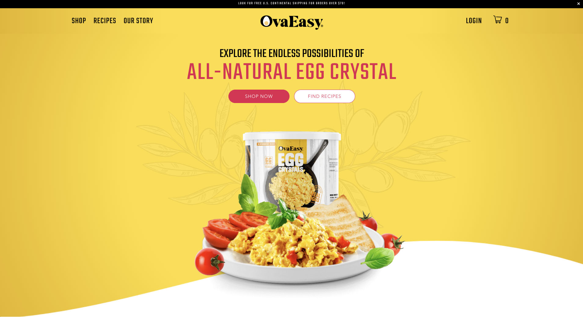
OvaEasy

OvaEasy is all about providing natural egg products with fresh ingredients. So when they came to us for a new website, exploring web design illustrations was only natural to give their website a fresh feel, too. Along with photos of their products in action, OvaEasy is able to use unique illustrations to support the appetizing aesthetic of their site. The illustrations add character and invite users to see what they can cook up.
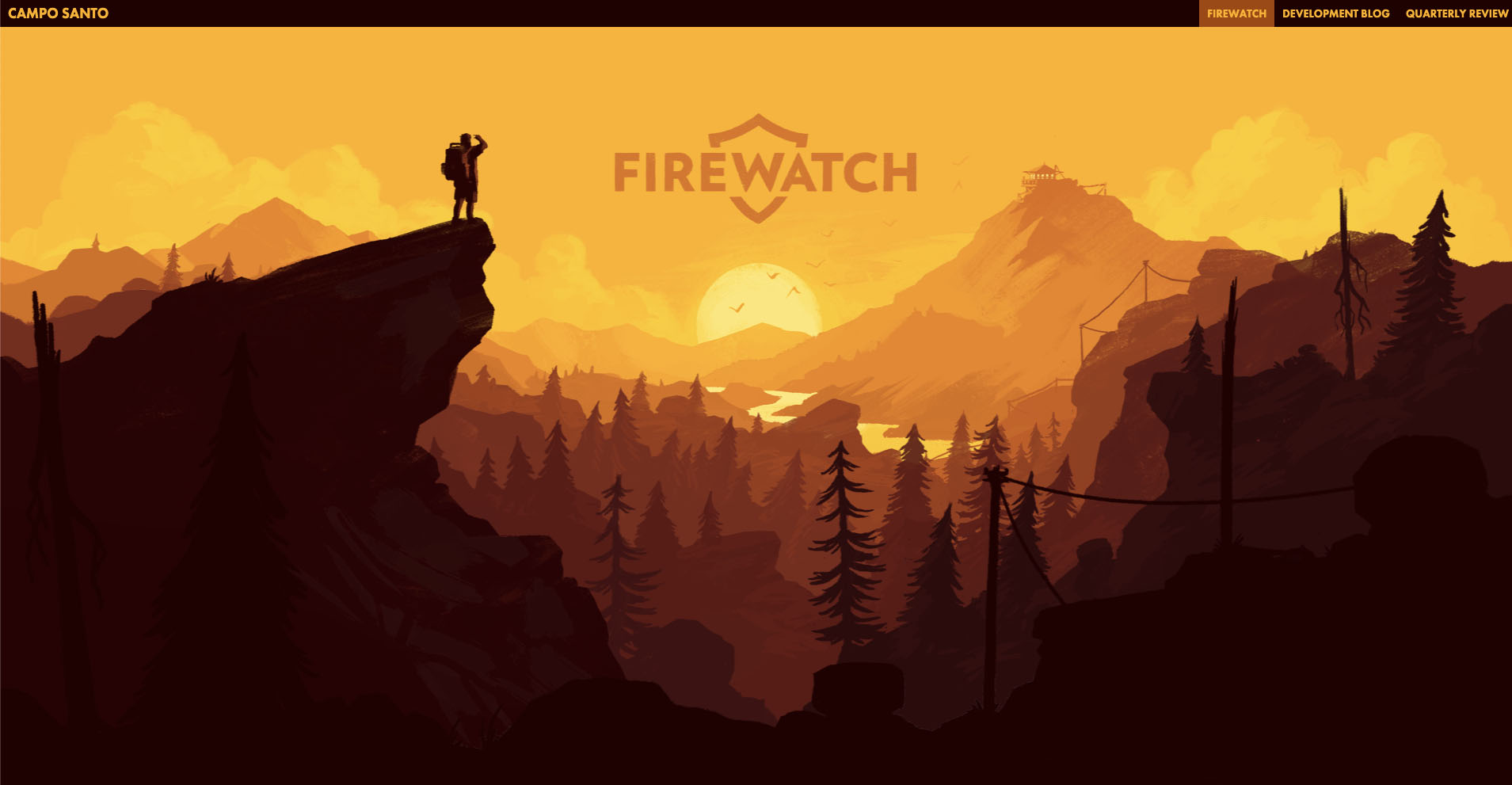
FireWatch

Bold but simple, the illustration featured in the website design for video game FireWatch evokes imagery from the game, creating a strong brand tie-in that feels immediately like an immersive video game experience. As a bonus, parallax animation adds engaging depth as you scroll down the page, inviting users to explore the scene further by purchasing the video game.
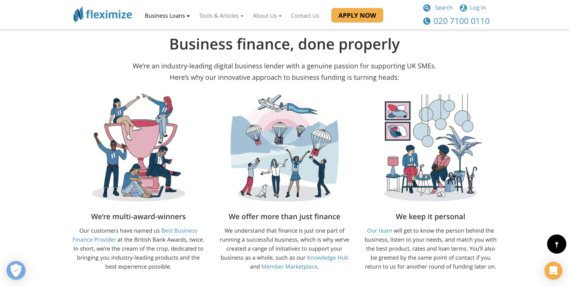
Fleximize

UK-based business loan provider Fleximize recognizes loans aren’t the most exciting topic to engage with, adding fun website design illustrations for a more welcoming approach traditional photos would fail to capture. Further down the page, real customer faces scroll across the screen in compelling testimonials to add even more meaning to the page.
Greater DSM USA

Based in West Des Moines ourselves, we were happy to help Greater DSM USA capture the vibrant culture and atmosphere of the Des Moines Metro area by incorporating artsy strokes and splashes of color reminiscent of the murals spotted throughout the city on their site. The bottom of the page brings the experience full circle, displaying fun fonts and colors to highlight Metro cities in a mural-esque design.
Interested In A Custom Illustration Website Design To Enhance Your Site? Contact Blue Compass For Picture-Perfect Execution!
At Blue Compass, we do our due diligence to keep up with the latest and best of web design trends, but we also develop our websites with functionality and features meant to last. If you’re feeling inspired from the illustration website examples above, contact our team to talk through a custom illustrated web design to help your business make its mark.