The Best Of Emerging Web Design Trends: Dark Mode Web Design
In recent years, dark mode design has evolved from a toggle display setting to a web design trend in its own right. Today, some of the most widely used streaming services, including Spotify, Hulu and Netflix, to name a few, opt for a dark mode web design upfront. Designing for dark mode exemplifies the best of web design trends because, if executed properly, user experience drives the design. As you consider your desired look and feel to modernize your business’ website, we’re confident the future is bright for dark mode designs.
What Is Dark Mode Web Design?
Dark mode web designs display light-colored text and visuals over a dark background, in contrast to the light-background, dark-text websites that have defined the past decade of web design. Sometimes referred to as “dark theme” or “night mode,” dark mode became a more prevalent web design trend as users started to note the strain of blue light from their devices, especially at night or in dark settings. Black backgrounds in website design are thought to emit less blue light, making the screen easier on the eyes.
Many businesses find a dark mode web design with clear contrast enhances their site visibility and accessibility for users. Darker, higher contrast designs don’t automatically make your website ADA-compliant, but if done well, dark mode designs can create a better user experience.
Best Practices When Designing For Dark Mode Websites
A dark mode web design doesn’t always make sense depending on your brand. For example, a black website design might come off as too aggressive for a nonprofit animal rescue organization trying to evoke warm and fuzzy feelings. But if you’re going for cutting-edge or sophisticated, dark mode can deliver. Here are a few best practices to keep in mind when designing for dark mode:
- Don’t use pure black or white: While high-contrast is the goal of a dark mode design, the stark contrast of pure black or white causes eye strain. Your site will be more legible and approachable with a variation of black or gray in the background along with a shade of white or another light color to accentuate copy. Better yet, use shades of your brand colors to create a dark design that feels true to your business.
- Be intentional about color choice: Highly saturated colors are too intense against a dark screen, so lighter, less vibrant shades are more impactful. Words should be easy to read and ADA-compliant no matter what color your background is.
- Add dimension strategically: Designing for dark mode doesn’t create the shadows that naturally occur against a white background. To add dimension to your black website design, incorporate lighter-shaded elements and other visual cues to illustrate depth and bring the design to life.
Daring Dark Mode Website Examples For Eye-Catching Inspiration
Effective dark mode website examples show the savvy innovation behind a business, communicating authority, expertise and precision. The best of dark mode web designs come from industry-leading brands who apply their inventive approach to a daring black website design.

Streamlined, efficient and cutting-edge, CO2 Refrigeration Systems’ came to Blue Compass seeking a black website design to reflect their vision as a forward-thinking supplier transforming the refrigeration industry. To achieve their mission, we featured their brand colors prominently against a dark background through tinted image overlays and interactive elements to capture attention and convey authority.

Argentinian design studio /nk is a dark mode website example that experiments with storytelling, another exciting web design trend. The space-themed background and animations uniquely position the brand as an ultra-modern partner willing to explore new creative possibilities.

Apple is no stranger to designing for dark mode, which became a feature of iOS devices starting in 2019. Here, the tech giant uses the dark mode web design trend to highlight their latest and greatest generation of AirPods. The predominantly black-and-white elements capture the immersive experience Apple aims for with their products, effectively tuning out the influence of other elements on the page.
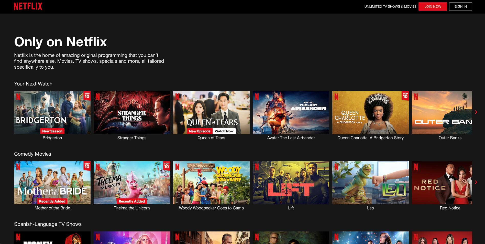
Netflix has optimized its user experience with a black website design, allowing movie and TV titles and trailers to catch your eye and draw you in. Think about it: a bright white background could hurt to stare at and ruin the atmosphere if you have the lights dimmed for a movie night. Netflix knows binge-watching is its bread and butter, so designing for dark mode ensures they make viewing as easy on your eyes as possible.
Considering A Bold Black Website Design? Our Dark Mode Designs Shine The Spotlight On Your Business
Blue Compass is here to turn the best of web design trends into lasting responsive website designs that reflect who you are as a brand. If the dark mode website examples above sparked a light bulb moment for you, reach out to schedule a 30 minute consultation to talk about your web design.