February 4, 2021
Grace Chrisman
Social MediaDigital MarketingBlue Compass Case Studies
Tested Results: The Best Twitter Image Size
If you’re looking for the perfect Twitter photo size, we’ve got the answer! After running into some photo mishaps on Twitter, our social media experts decided we needed to make a change. We tested multiple image sizes on different mobile devices, tablets and desktops and finally found a solution that looks great no matter what device you’re using. The answer might surprise you, because the ideal dimensions are not any of the recommended Twitter image guidelines.
Trial & Error: Determining The Perfect Twitter Image Dimensions
Our frustrations began back in September of 2017. The office was celebrating Blue Compass’s 10th anniversary, and to announce this impressive milestone we put together a huge social campaign. We displayed quotes from years past and reflected on how much the company has grown and adapted to the ever-changing world of digital marketing.
To our surprise, we noticed that the words on the images were being cut off when viewing Twitter on mobile. It looked fine when we checked it on desktop, but when we scrolled through on our phones, the Twitter photo size was obviously incorrect.
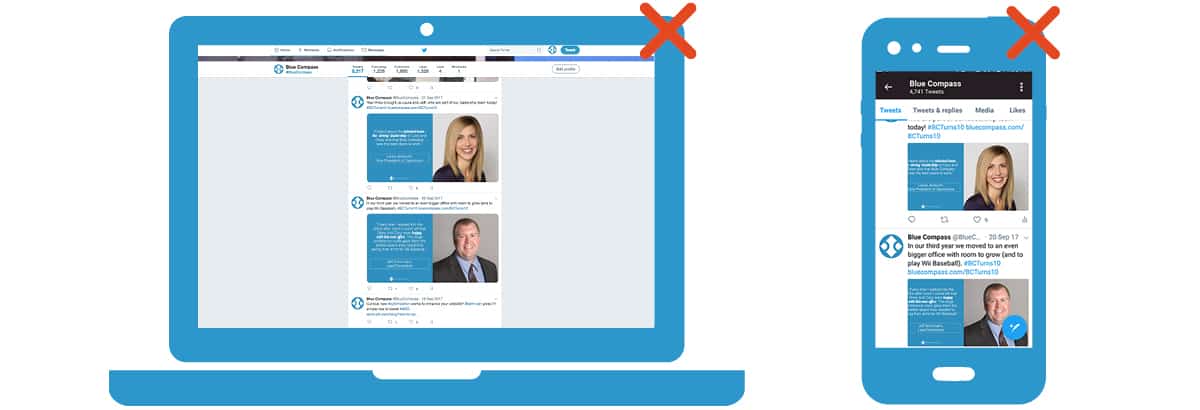
At the time, we were using the same-sized images we used for Facebook (1200 x 628 pixels) since Facebook and Twitter shared such similar dimension recommendations. We knew other images we posted had words close to the edge, and we had other images with text in the “safe area” where text would never get cut off but still looked slightly off on mobile. Since this wasn’t working correctly on mobile, we needed to find a better Twitter image size.
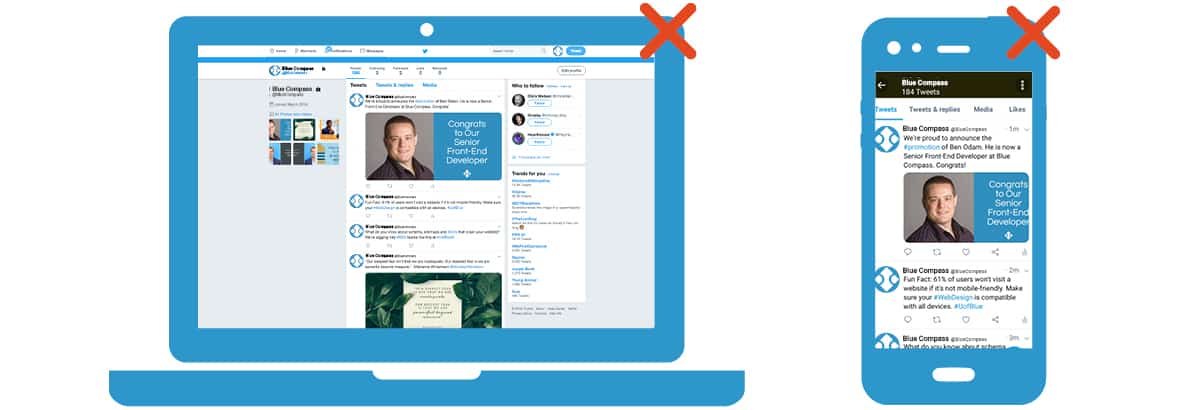
Testing Twitter's Recommended Image Sizes
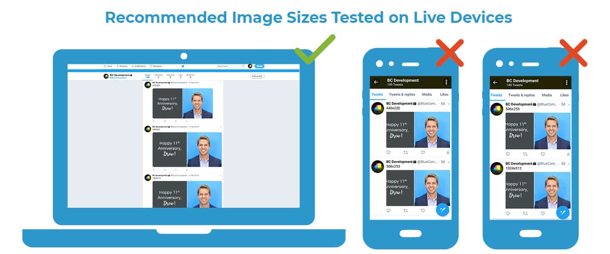
The testing started with three image sizes, all of which were recommended by Twitter, which suggests that images should have a 2:1 ratio. Our team also discovered a website called BrowserStack that allows developers to test website pages from multiple devices and internet browsers to check if a site is mobile-friendly. You type in the website URL and can supposedly see what the website would look like from the specific device of your choice.
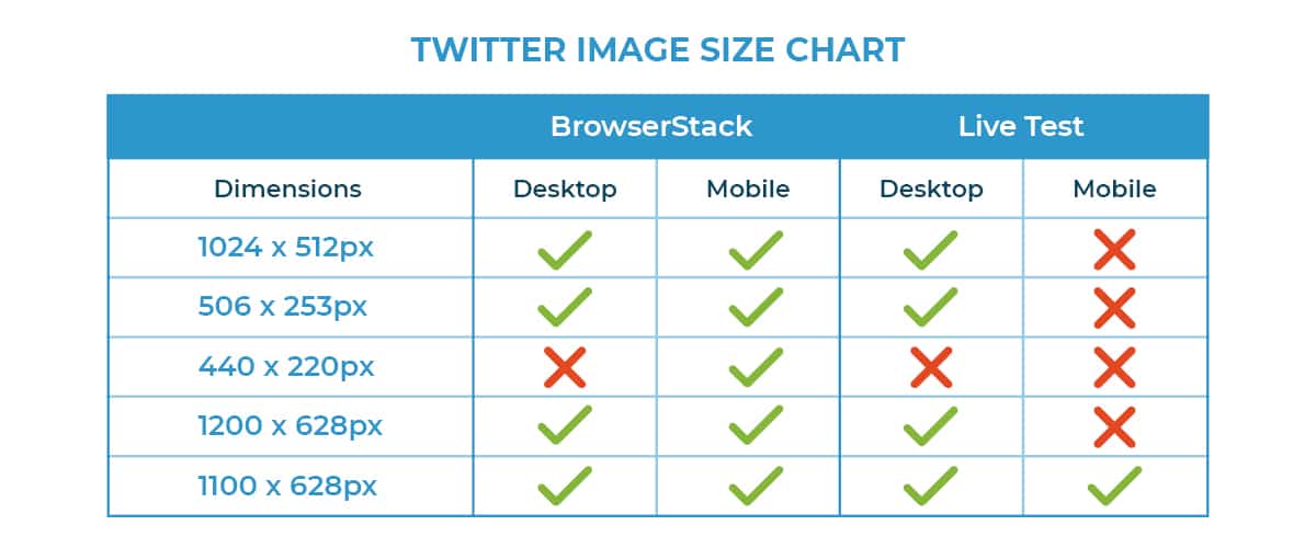
Using BrowserStack, we checked the three recommended image sizes on Apple and Android phones and tablets, as well as Apple and Windows computers. All of these new image sizes looked great on each device! We were surprised at how easy it seemed to find great Twitter photo sizes after our social media mishap, but we learned that sometimes online tools can be misleading. Read on to find out where we went wrong.
Although everything appeared fine in this program, we ran into a bit of an issue. After double checking on our laptops and mobile devices, we discovered the recommended image sizes were worse than the original photo we started with.
Twitter Image Size #1: 1024 x 512 Pixels
These dimensions are the maximum recommended post size on Twitter. There appeared to be no issues on either devices with the large size. We'll show the examples we saw in BrowserStack below.
Twitter Image Size #2: 506 x 253 Pixels
Similar to the previous Twitter photo size, these dimensions were supposed to be ideal for desktops. They seemed flawless on all devices according to our test site.
Twitter Image Size #3: 440 x 220 Pixels
For our last test, we used Twitter’s minimum recommended sizing option. We found that even in BrowserStack the image appeared much smaller than the other two options and left empty white space on desktop which was not ideal for images.

After an easy round of testing which didn’t seem to match up with our past trouble with Twitter images, we decided to check on our phones. Even though everything looked perfect when using BrowserStack, when we tested the images on our personal devices none of these Twitter image sizes seemed to be right! The text was still getting cut off in every post - in fact, it was even worse than we originally thought. At this point, we decided a new approach was needed.
Testing Image Dimensions Not Recommended By Twitter
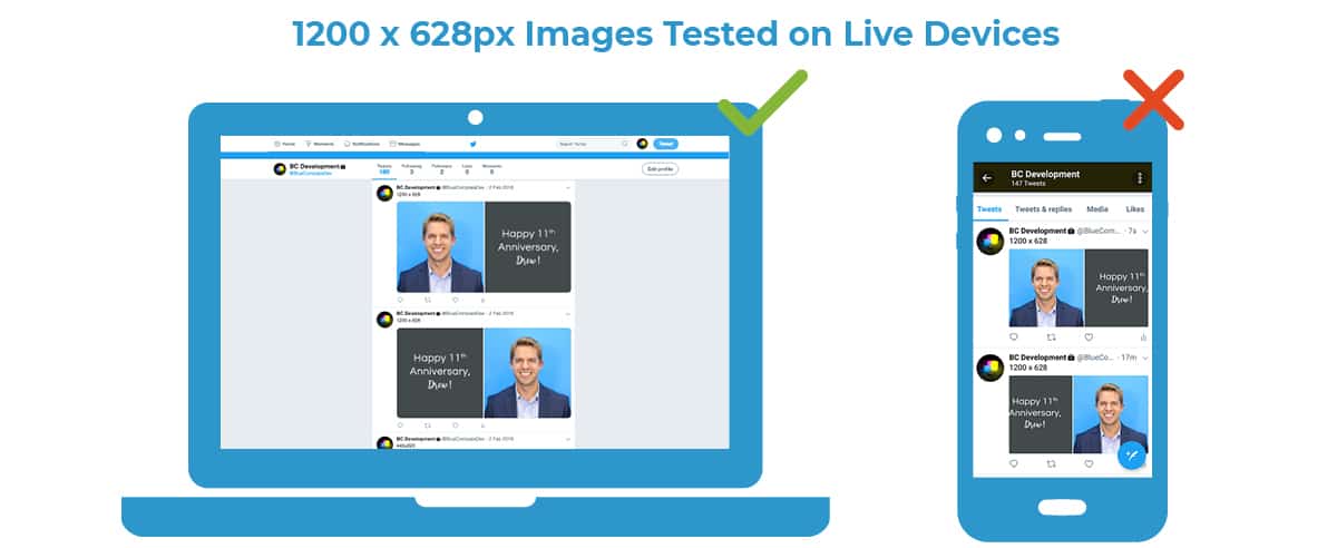
Twitter Image Size #4: 1200 x 628 Pixels
We decided to analyze our results to see what tweaks we could make to the recommended Twitter image sizes. The photo size we originally used appeared normal on desktop but had issues on mobile. It didn’t cut off any words like some of our other test posts; instead, it cropped the photo right up to the borderline where the text started. We noticed only the side with text was affected by the cropping, so we flipped the layout of the image (moving the photo to the left side). In the new post, the picture was still unaffected, and the post was cropped right up to the end of the text. This revealed to us that no matter where the text is placed on an image, Twitter will favor a face or the artistic elements of an image over text.
The Outcome: An Optimal Twitter Photo Size For Great Results
Twitter Image Size #5: 1100 x 628 Pixels
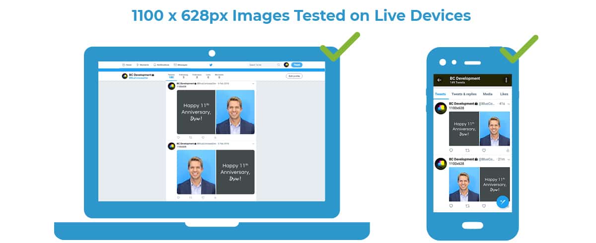
The image was getting cut off by the same amount each time, so I asked our graphic designer to reduce the image by just enough pixels to match the cut-off line, which adjusted the ratio a bit. We made two images in this size, again testing the text on each side. After testing a variety of sizes to resolve our issue, we finally determined the best Twitter photo size that looks great on desktop and mobile!
Additional Takeaways
Check everything you post on multiple devices. Whether it’s your website or a social post, you want everything with your company name and logo to look its best! It’s worth the extra time to make sure everything looks exactly the way you want it to. We know not everyone has access to all types of devices and their different versions, but we know from personal experience that testing on physical devices can produce different results than third party tools.
Twitter prefers real photos over photos with text. Remember that when we tested the Facebook dimensions on Twitter, we saw similar results. Both times the photo half of the images were unaffected and the text side was cut off, so we can assume that Twitter knows the difference.
Create a private account for testing. All of these Twitter image size tests were completed through our team’s private Twitter account. We not only test image sizes, but we also use the account to test Twitter cards. Having a private social media account gives you the freedom to try new things without it being viewed by the public, leaving real social channels looking flawless.
Why Twitter Image Dimensions Are Significant
Testing to get the best Twitter photo size is crucial because it affects the quality of your social profiles. Businesses want their brand to look sharp on every platform. It doesn’t look professional when important information gets cut off. Using correctly sized Twitter photos will ensure that visitors notice your excellent content, instead of a little social media mistake.
If you need help boosting your social media presence, contact the social media marketing experts at Blue Compass! We’re happy to answer any digital marketing questions.
